Adobe's color-coded new office
Adobe's color-coded new office*
We have touched upon the impact of colors on people's perception and senses many times in our previous blog posts. We have mentioned numerous times how the color of the working environment can affect employees' motivation, productivity, creativity, mood, efficiency, and perception of the environment. Adobe, one of the world's leading companies in its field, has taken a significant step emphasizing the importance of colors.
Adobe is a multinational computer software company established in Delaware and headquartered in San Jose, California. It's a leading global company specializing in software for the creation and publication of various content, including graphics, photography, illustration, animation, multimedia/video, motion pictures, and print. In its new office named "Founders Tower," Adobe opted for color codes where every hue has a specific function to reduce the cognitive loads of its employees.
Utilizing neuroscience in the design phase, Adobe used colors both for branding and as an auxiliary tool to facilitate employees' tasks by reducing their cognitive load. Adobe collaborated with an architectural firm and a consultancy company that specializes in color strategies for the interior design of the building.
Guided by the consultancy company, Adobe utilized color psychology to naturally direct employees to spaces that suit their needs. The company chose three different color palettes to denote the purposes of office sections: blue for focused workspaces, green for meetings, and orange hues for community building and social interaction.
According to color psychology, spaces painted with blue hues, equipped with office desks and semi-private work cabins, aim to enhance concentration and clarity of thought. Meeting rooms and team hubs painted green are designed to stimulate brainstorming sessions and productive meetings. Its soothing effect is also believed to facilitate cooperation and compromise. The yellow added to the predominantly green space adds the joy it evokes. Orange, representing trust and sociability, is aimed to enhance social interaction in rest rooms.
You can access our blog posts related to the importance of colors here.
*This blog post is quoted from an article titled "Adobe's New Color-Coded Office Inspired by Neurology" published on Bigumigu.
Latest Articles
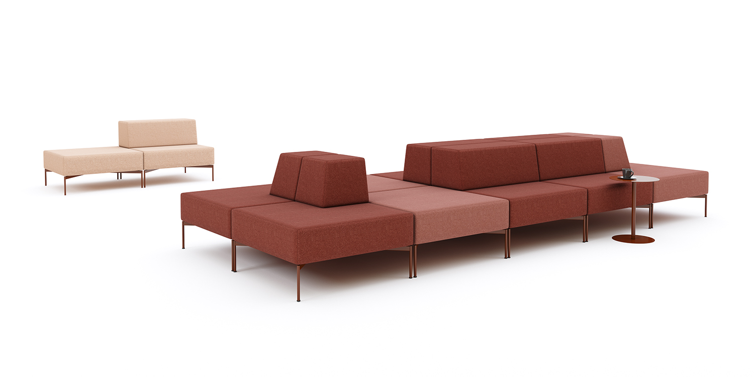
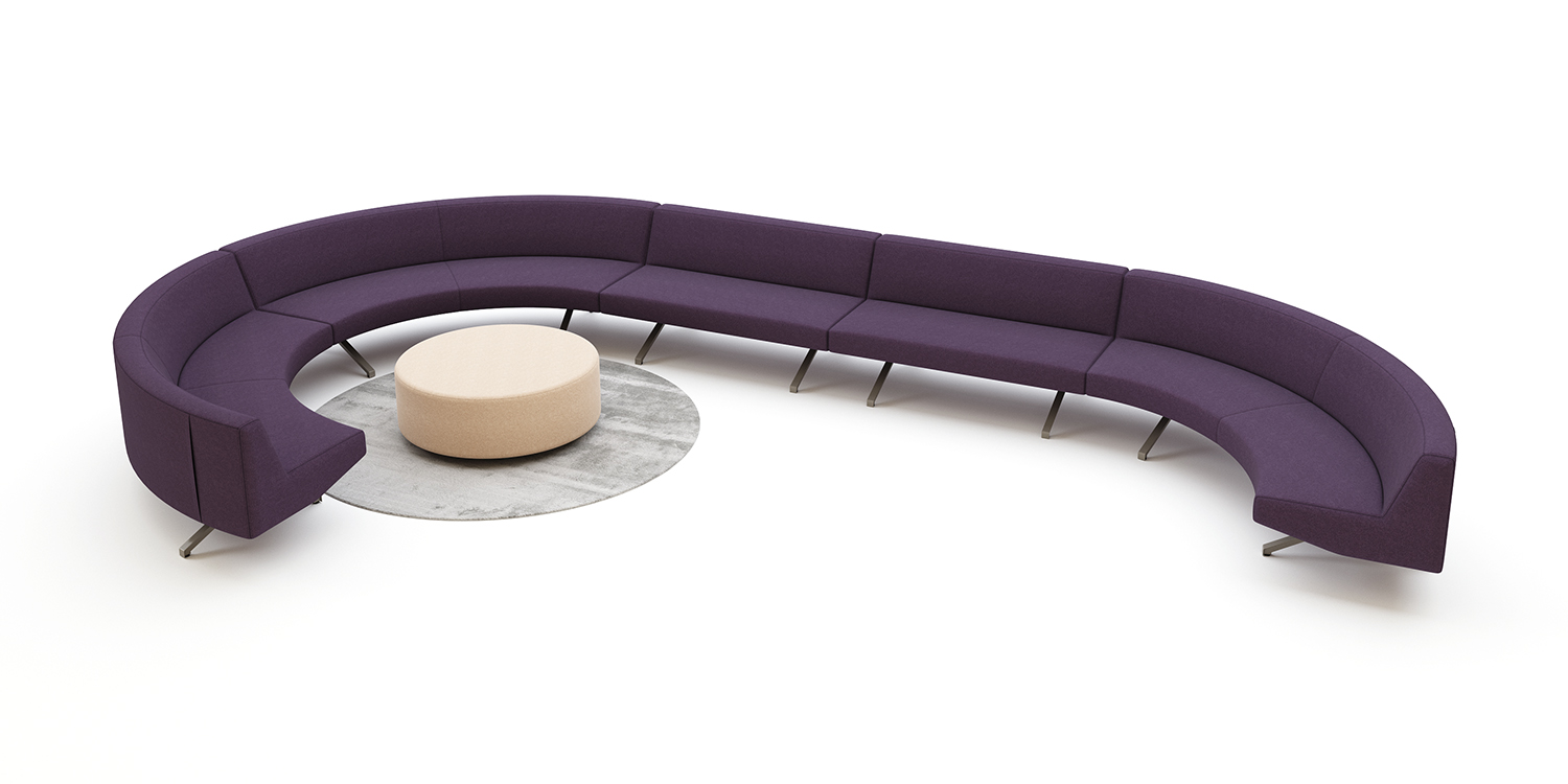
 Flexibility, Sustainability, and Functionality: The Contribution of Modular Furniture to Design
 - Sustainability and Flexibility Take Center Stage in 2025 Office Design
- 2025 Office Design Trends
-
Shaping the Future with Sustainable Materials
-
The Future of Office Design: A Performance-Based Approach
-
2024 Office Furniture Trends: Innovative and Dynamic Workspaces
-
How to Design an Efficient Office
-
Office Furniture Use in the Tourism Sector
-
Furniture in Co-working Spaces is Simple, Colorful and Modern
-
New Generation Offices for Gen Y and Z
-
Office Furniture Use in the Education Sector
-
We Will Be Back to Office Despite Everything
-
Resimercial Design in Modern Workplaces
-
Ergonomics = Comfort + Ease + Efficiency
-
A Few Tips for Home Offices
-
Offices Meeting the Expectations of Generations Y and Z
-
Shape of Tomorrow